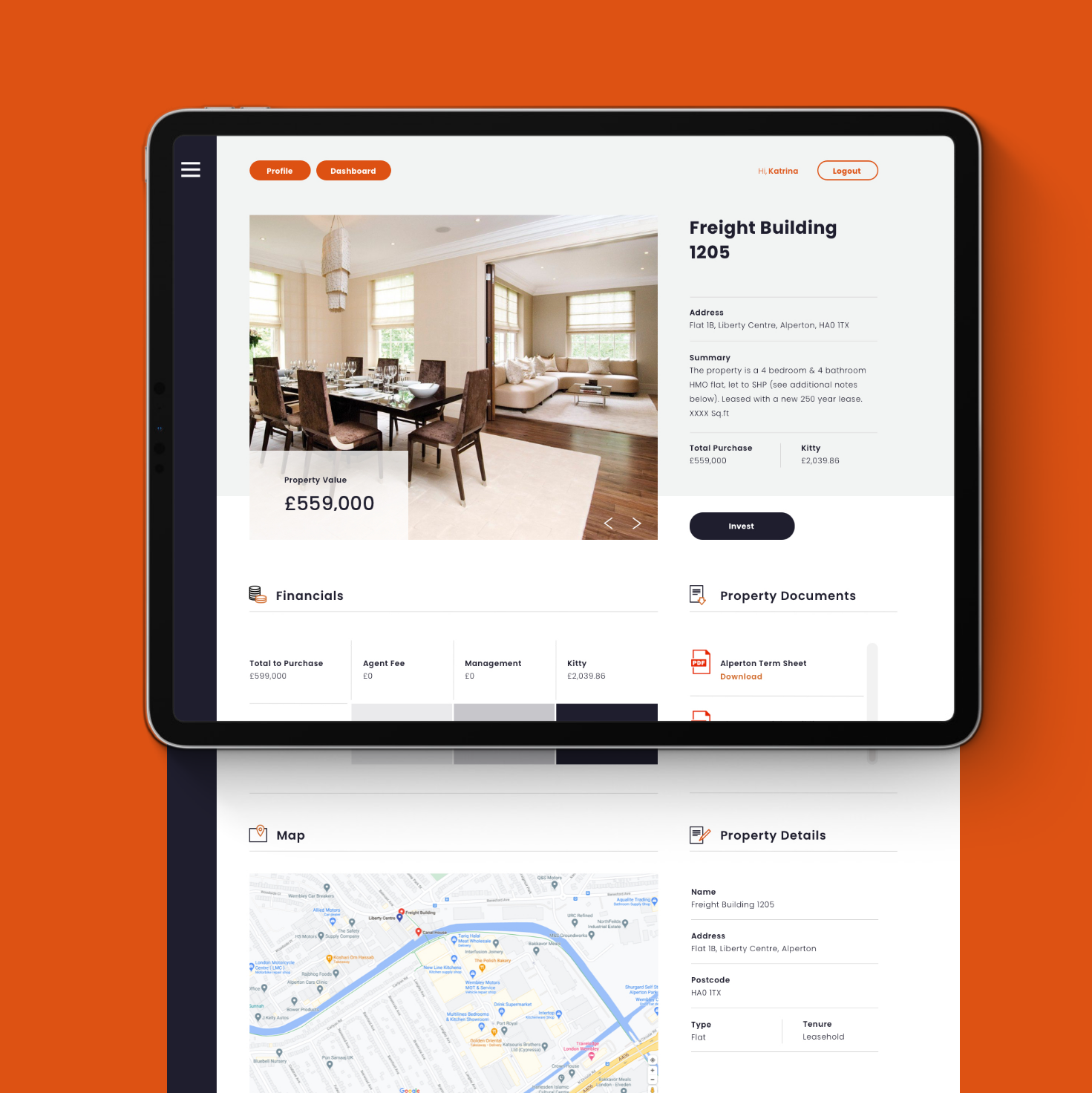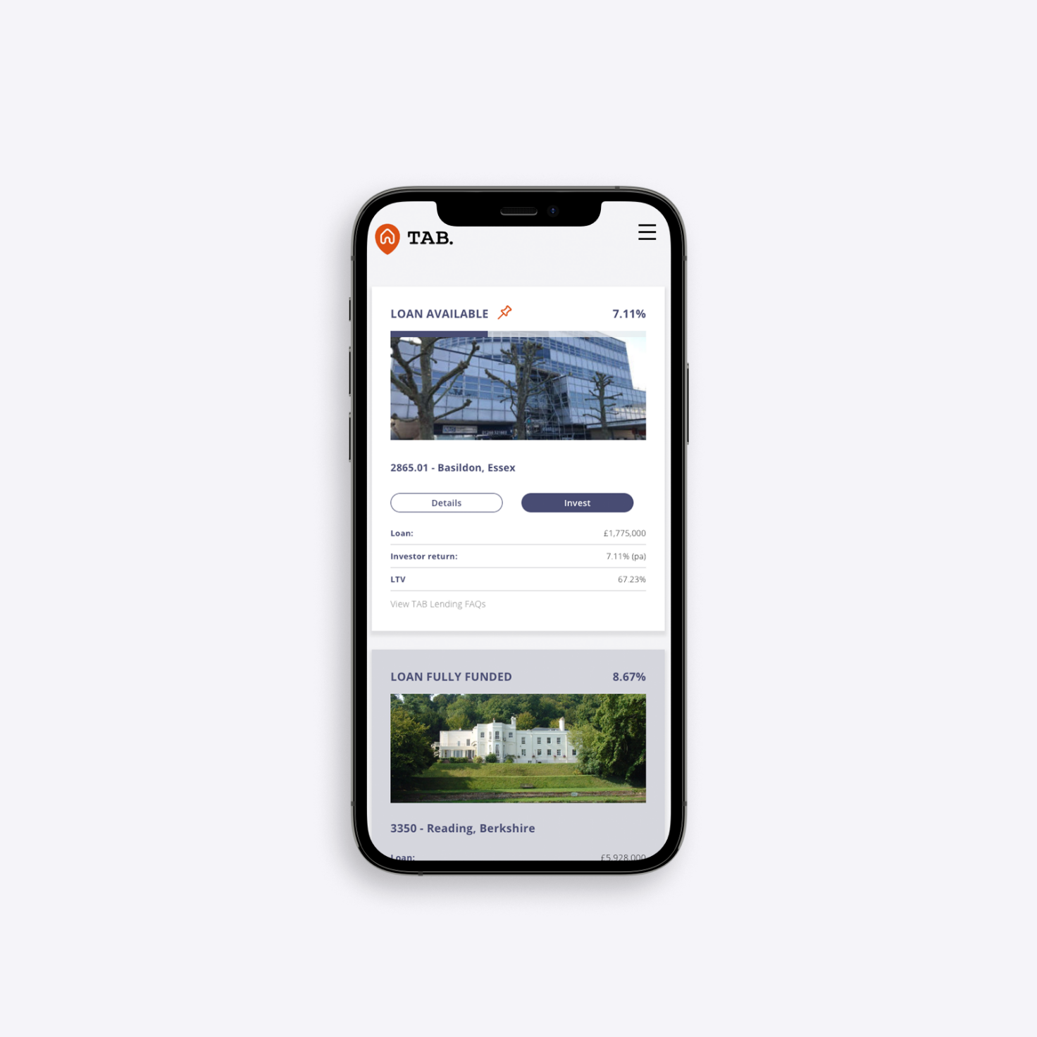
short term bridging
with long term
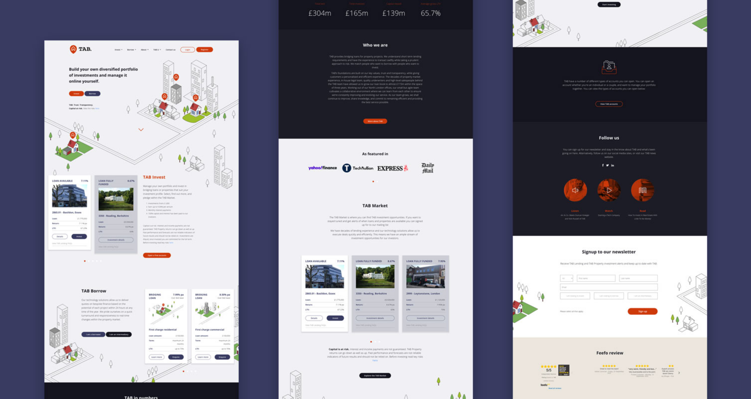
branding
The brand was one which was focussed around opportunities. With simple colour variations, we could show the growing success of Tab and open up conversations for new opportunities.
;)