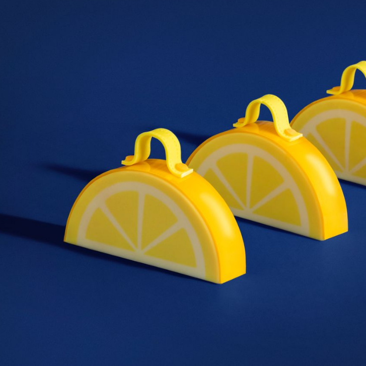
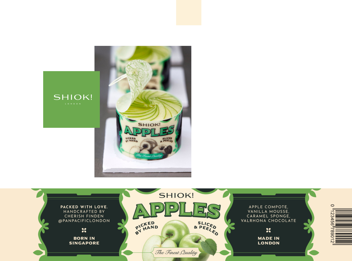
Layered concept
Each bespoke pattern was inspired by the flavours and ingredients Cherish uses in her creations.


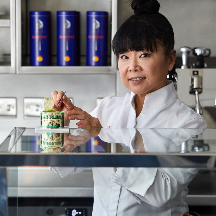
How do you position a brand for Cherish Finden, one of the world’s best chefs?
Brand
Packaging
Guidelines
Illustration
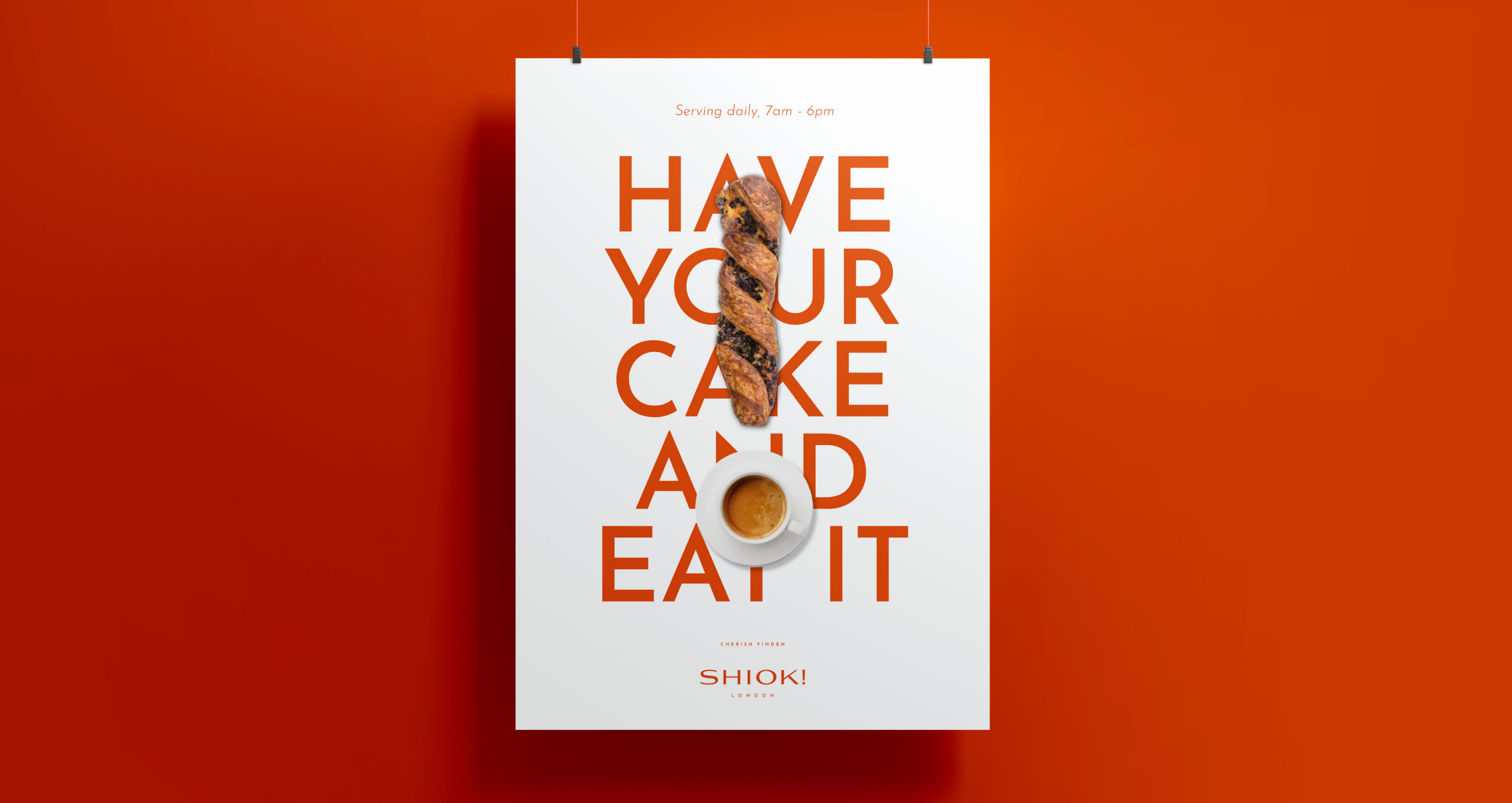
Campaign
A brief from the design Gods. The brief was to create a brand for Cherish Finden which expressed her passion, talent and heritage.
Shiok! stands for the unexpected, a wow moment and never has a name been so apt for what you can experience in her patisserie. So how do you brand that up?


Each bespoke pattern was inspired by the flavours and ingredients Cherish uses in her creations.
We are delighted to have continued working with them on a project basis. Despite the moving timelines the team were always flexible and cooperative. From concept to execution the team at Bunker were professional and passionate with clear creative vision and have always felt like part of the Pan Pacific London family.
Katie Snow | Head of Marketing Communications – Pan Pacific London
;)
An ideas driven brand with lots of layers and depth, just like her food.
We went with bold complimentary colour and used the peranakans to draw clues as to what you might experience in Cherish’s baking. The brand is distinct and is a nod to English and Singaporean heritage.
The brand has been hugely successful, enabling the team to draw huge volumes of traffic to the shop while having great recall and recognition. A massive team effort., we even got a love it, love it, love it from the lady herself.